Second Life Kitchen
01 The Brief
02 The Approach
03 The Process
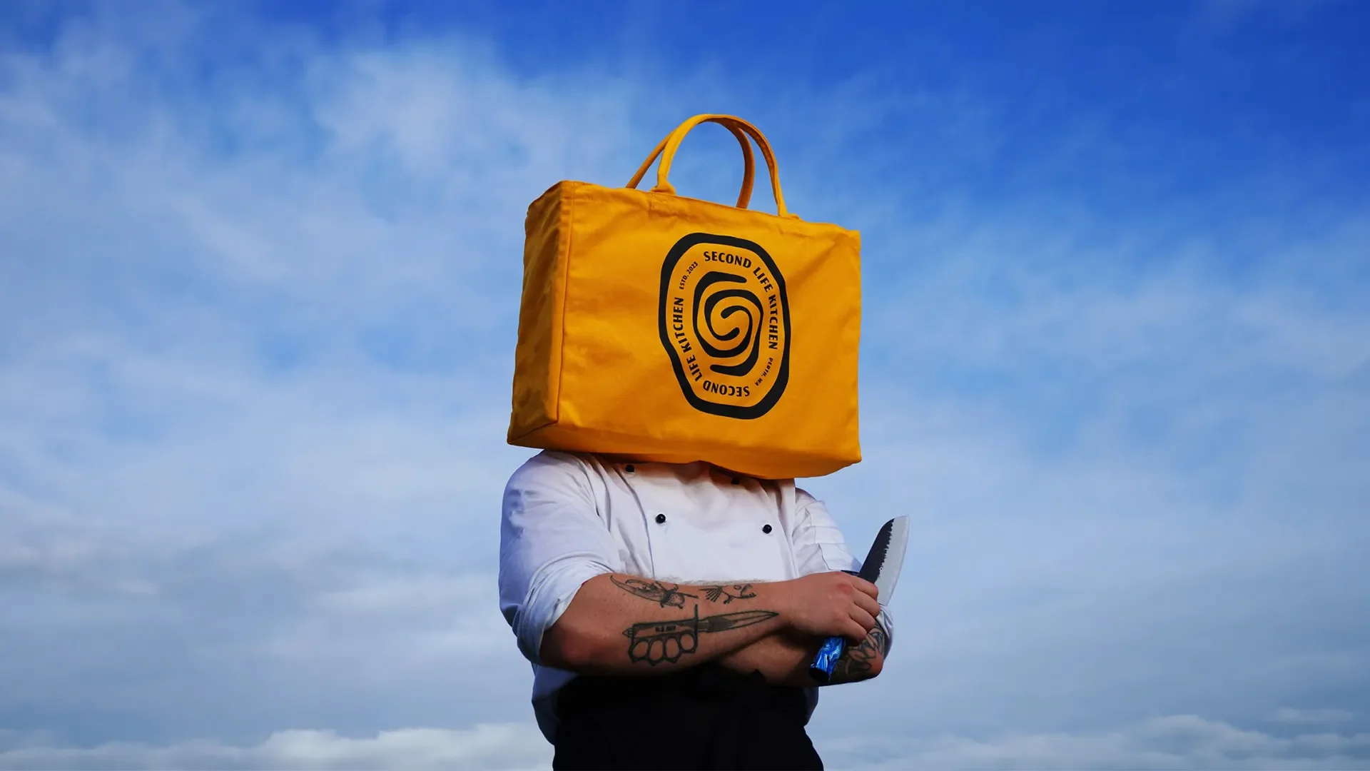
Second Life Kitchen (SLK) makes premium kitchen knives with handles made from 100% recycled plastic, saving it from landfill. It was founded in London in 2023 by ex-chef Kieran Mays. When Kieran was relaunching the business in Western Australia, he came to Clueless Design Co for a premium rebrand. SLK's original identity felt amateur and no longer fit where the business was heading. He wanted a luxury brand that doesn't take itself too seriously, and a logo his audience would associate with three words: trust, innovation, and considered. We built a new identity from the ground up: logo, typography, colour and packaging.
Every decision came back to one idea: the knives are the centrepiece.
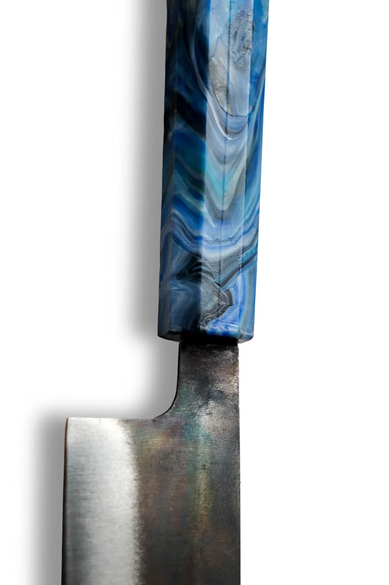
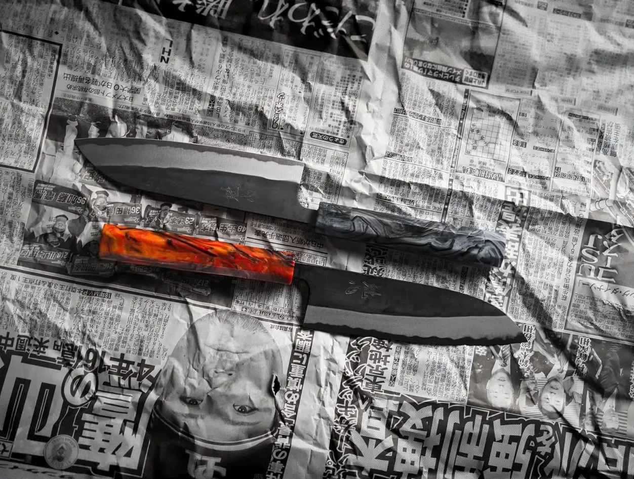
Let the handles lead. Each handle is vivid and one of a kind, so the identity takes a minimal approach. It frames the product rather than competing with it.
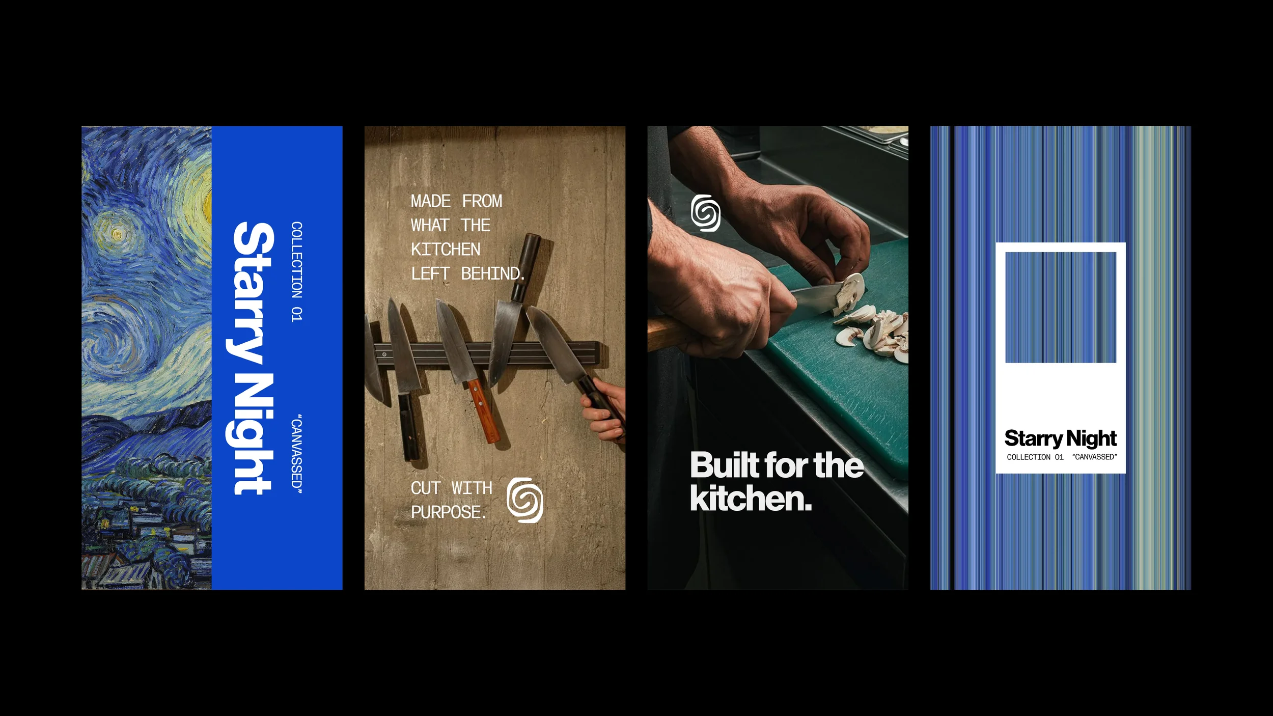
Built to flex. SLK releases its handles in themed drops, and each drop looks different. The system had to hold together whether the handles are Van Gogh blues or something else entirely.
From hobbyist to premium. The brand had to give a small, founder-led business the presence of an established name in a new market.
SLK serves serious home cooks: people who know their way around a kitchen and want to take their knives to the next level. Its values are sustainability, quality and difference, turning the knife from a bland everyday tool into the centrepiece of the kitchen.
THE MARK
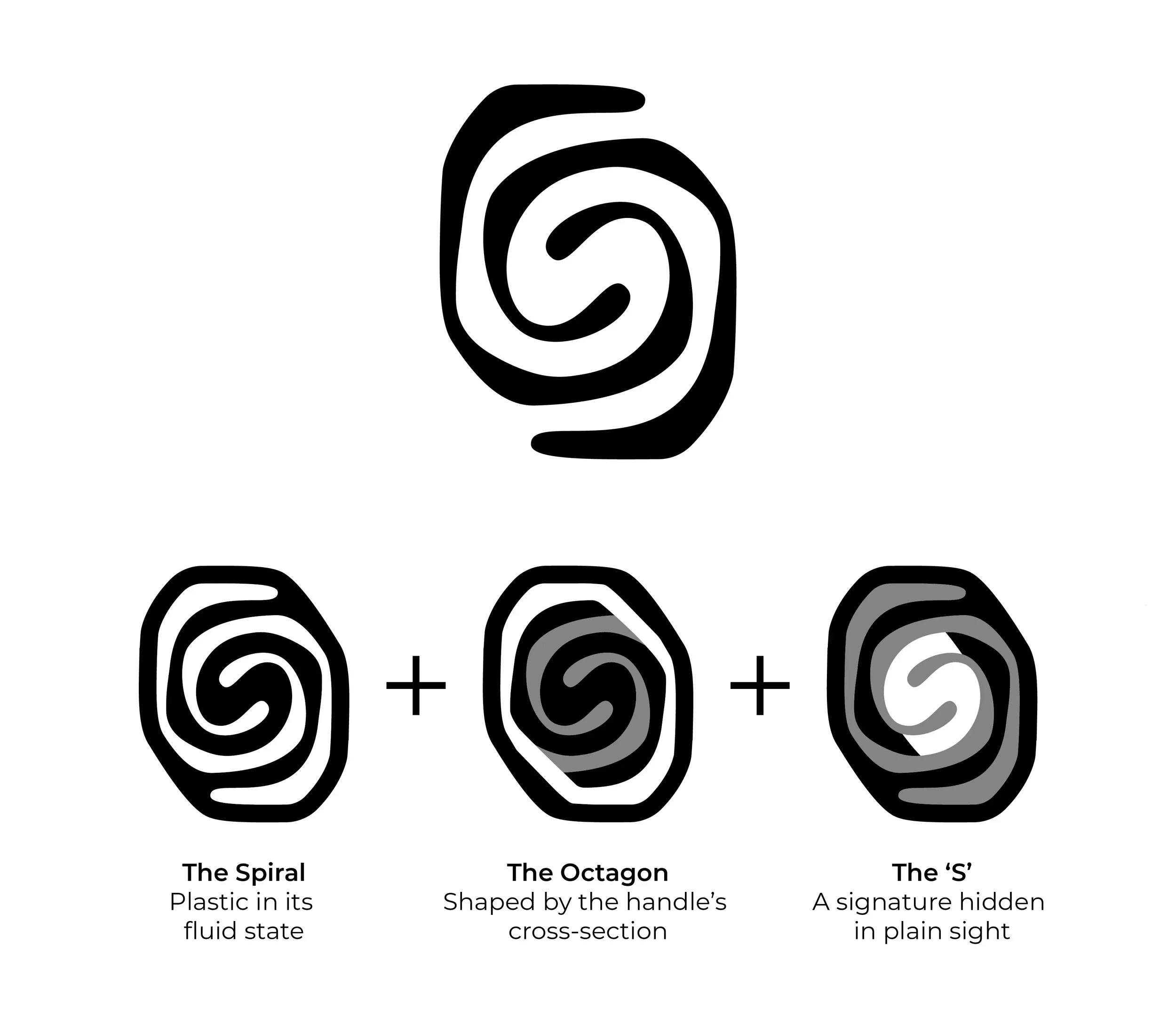
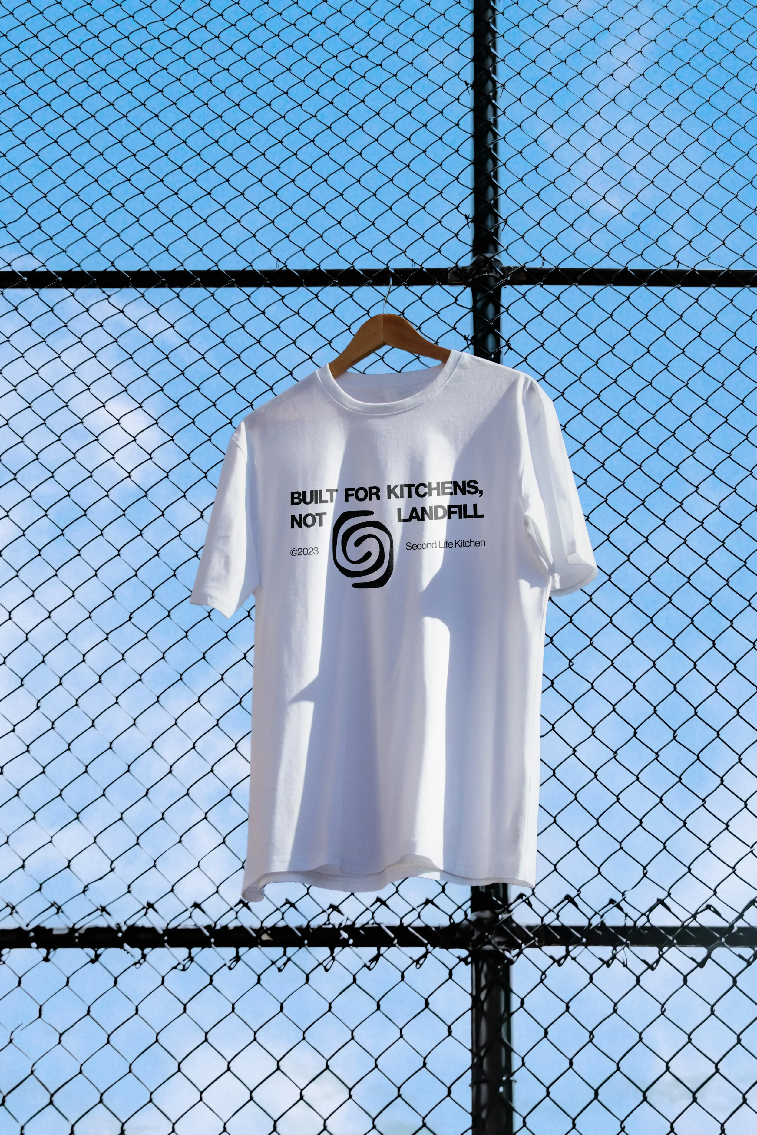
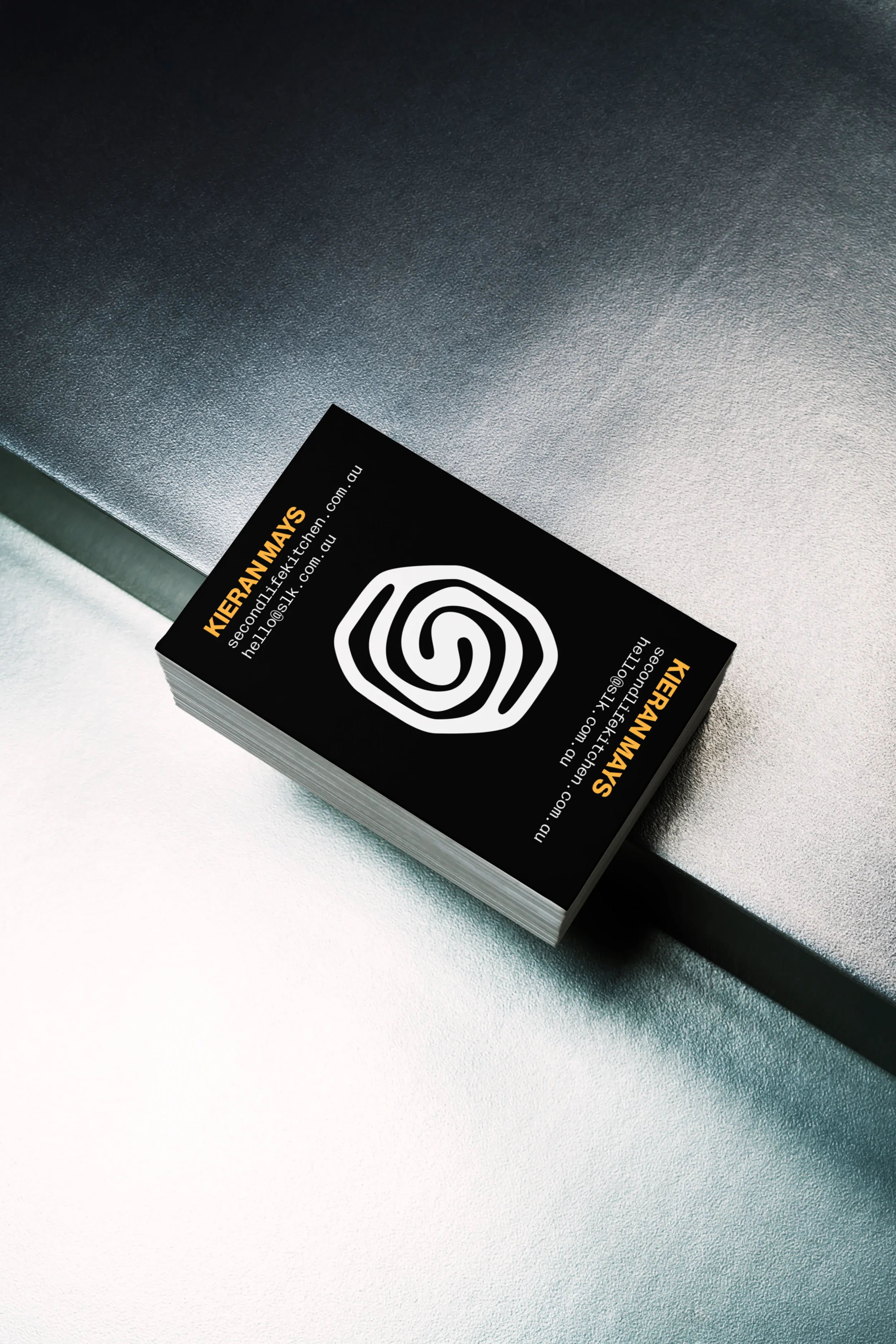
The mark is built from three ideas, each tied to how an SLK knife is made and held, and it's simple enough to stamp cleanly onto a blade.
The Spiral Plastic in its fluid state
The Octagon Shaped by the handle's cross-section
The 'S' A signature hidden in plain sight
TYPE & COLOUR
Type and colour follow the same minimal approach, so the knives stay the focus.
Neue Haas Grotesk is the primary typeface. The Display 75 Bold, tightly tracked, gives headlines a confident presence, while the Text 55 Roman keeps body copy clear in print and on screen. Two supporting faces add personality. Freight Big Pro Book Italic brings a warm, editorial note to highlights and pull quotes. Forma DJR Mono sets labels, product specifications and packaging details, nodding to the precision behind every knife.
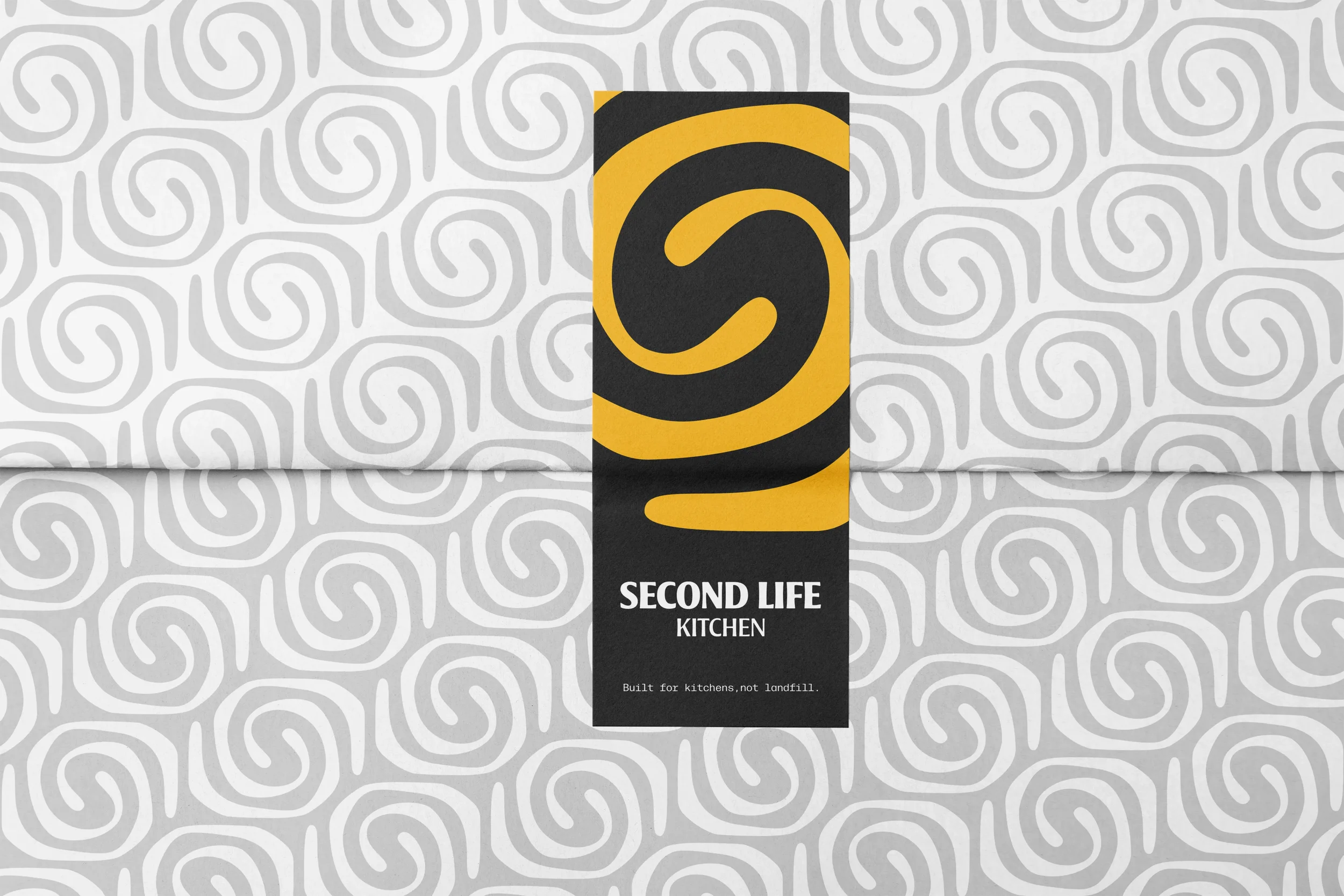
The palette is built on black, white and grey, with yellow used sparingly as the accent. With every drop bringing new handle colours, a neutral base lets each collection stand out while the brand stays recognisably SLK. Steel Grey is a nod to the blade at the heart of the product.
04 The Outcome
We delivered six versions of the logo, so SLK has the right one for every format: stacked, horizontal, logomark, monogram, location and badge. The mark sits on the blade itself and carries through the packaging, so the identity travels with the knife from the kitchen to the customer's door.
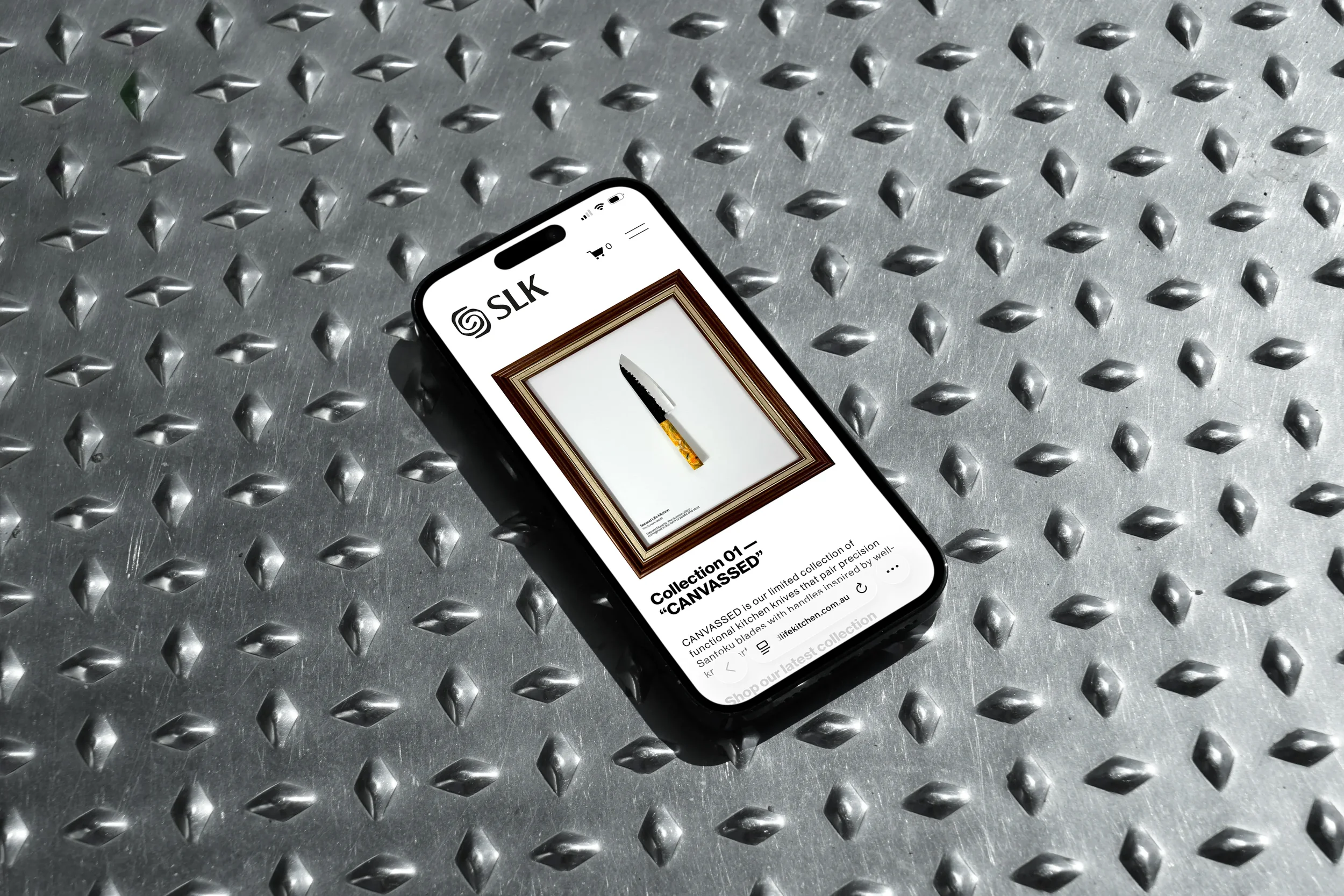
The flexible system has already been put to work. CANVASSED, one of SLK's drops, features handles inspired by famous paintings, starting with Van Gogh's The Starry Night and Edvard Munch's The Scream. The neutral identity lets each drop take the spotlight without the brand losing its shape.
05 Testimonial
“I first contacted Zach & Ryan when I was rebooting my brand and desperately needed a refresh.
There were so many aspects of my brand I hadn't considered, which was overwhelming, but I was coached through it every step of the way. They were attentive, creative and thorough, and after a couple of meetings, they locked down exactly what I needed.
The result was a complete rebrand: not just a logo, but an understanding of my brand's DNA that has let my own creativity flourish. SLK has jumped from a hobbyist product to a brand respected in the industry.
I couldn't recommend Zach & Ryan more”.
Kieran Mays, Second Life Kitchen
Next Project: