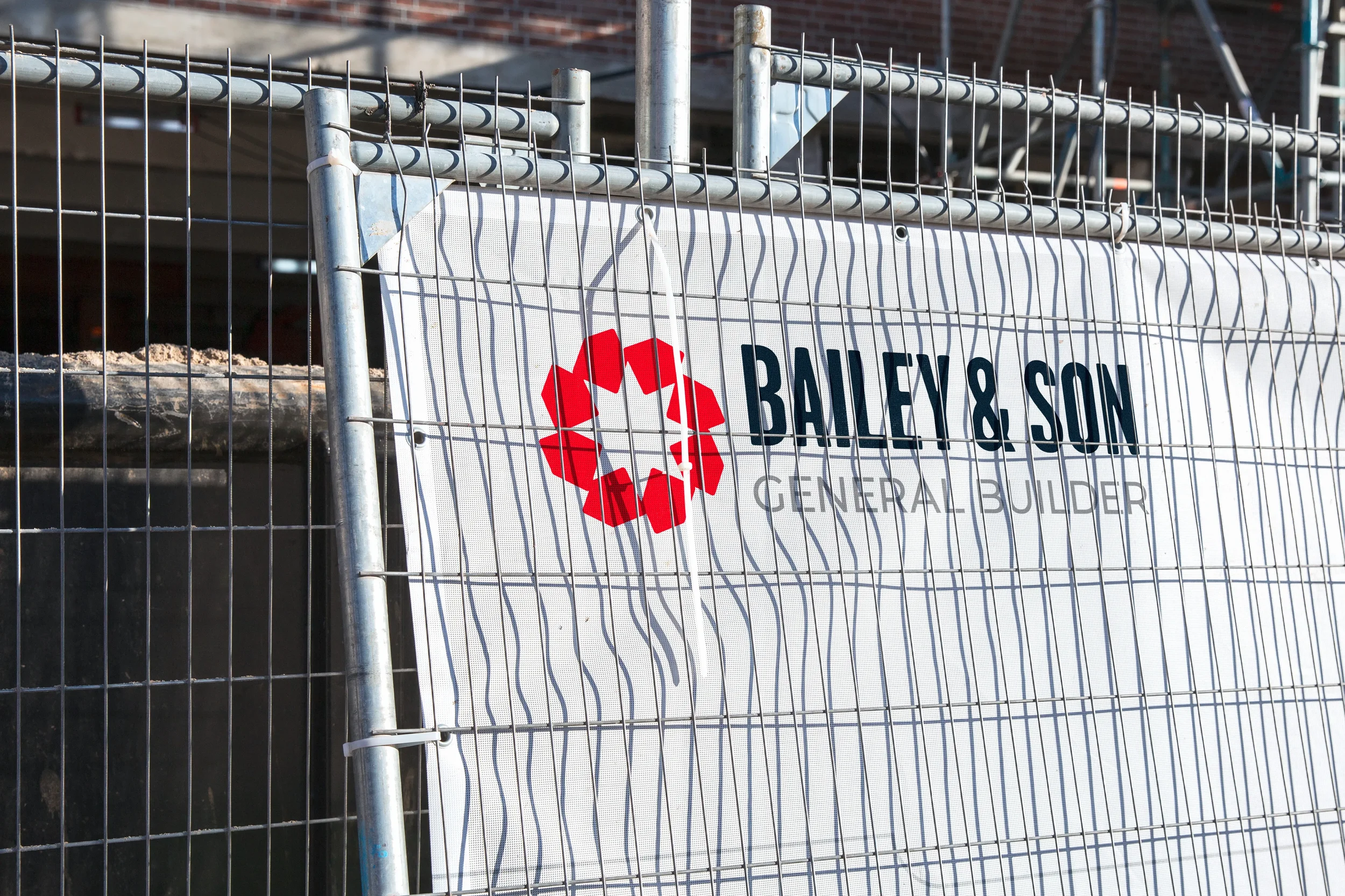
Bailey & Son
01 The Brief
02 The Challenges
03 The Process
Mark Bailey is a general builder and advanced craft bricklayer based in Essex. After a break from working for himself, he was returning to self-employment and needed a brand to launch it. He wanted an identity that looked professional and clearly showed what he does, and it had to sit comfortably alongside his existing pink, light blue and grey uniform.
Mark was starting from nothing visual, in a trade full of clichés, and the brand had to carry two ideas without looking busy.
Standing out in a crowded trade. Builders' branding leans on hard hats, trowels and roof outlines. Mark's needed to say "builder" without looking like everyone else's.
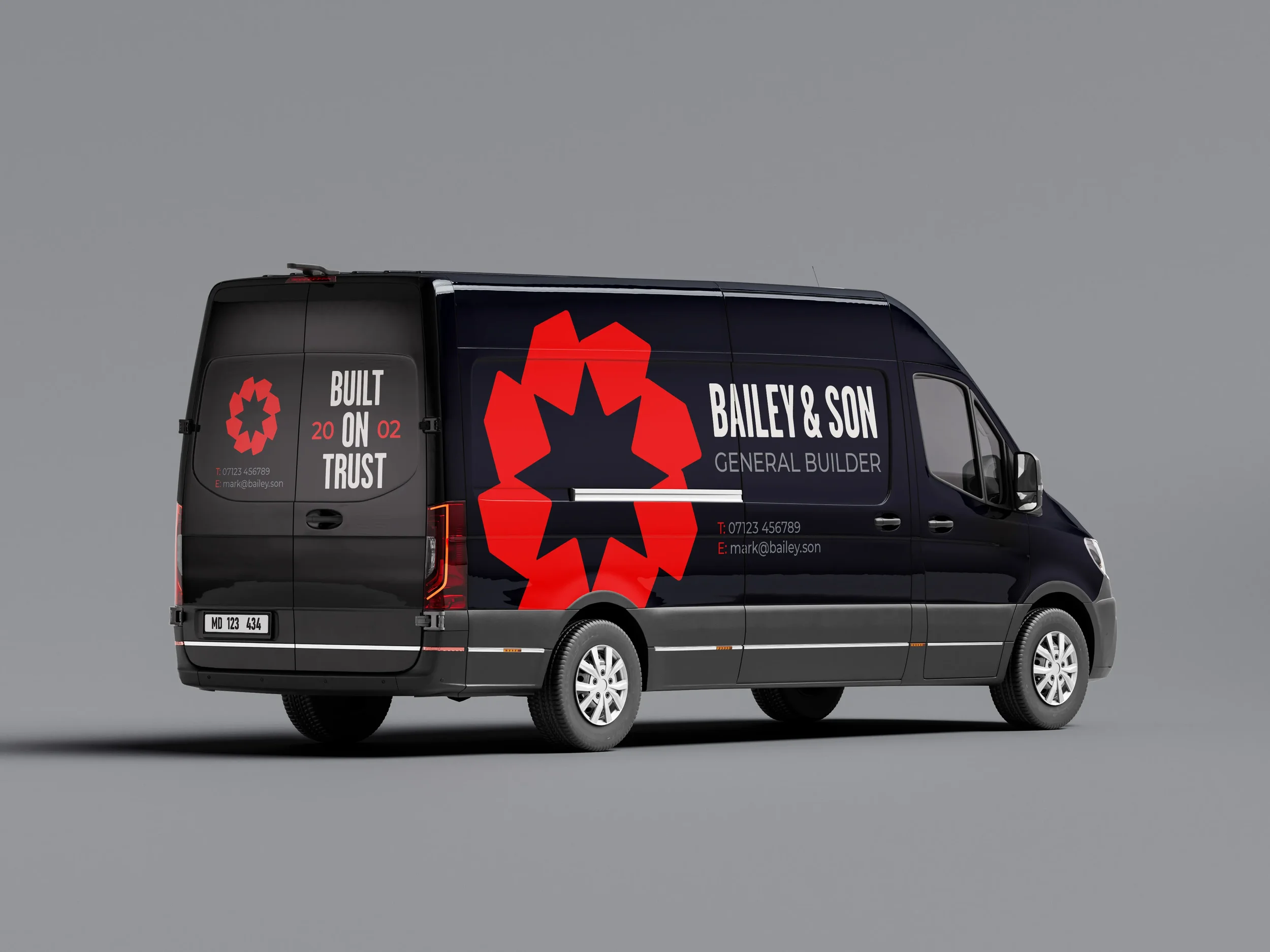
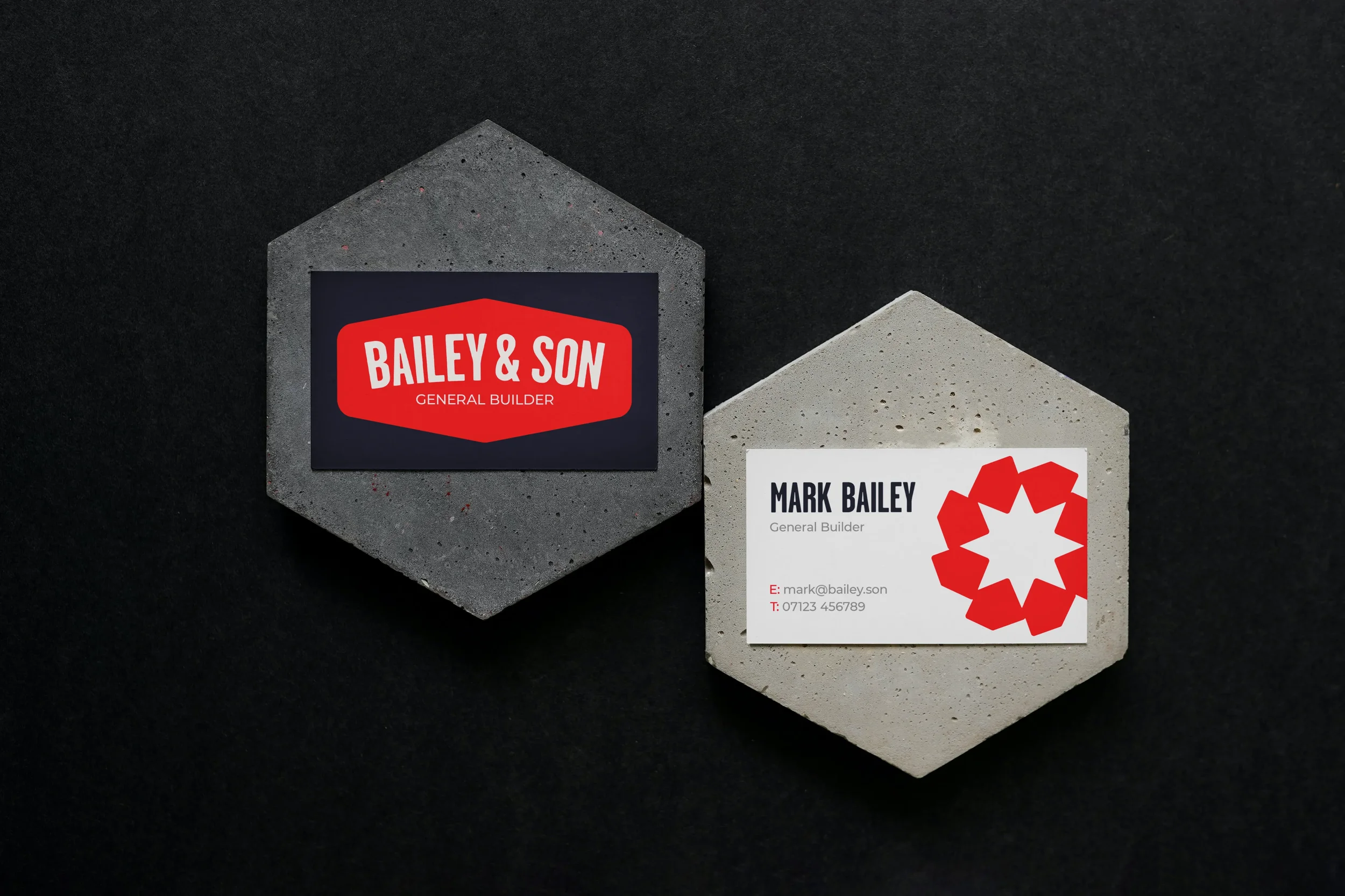
Built to work at every size. The logo had to read from a moving van and still work small on clothing and business cards.
Working with an existing uniform. Those colours were staying, so the new palette couldn't clash with them.
THE NAME
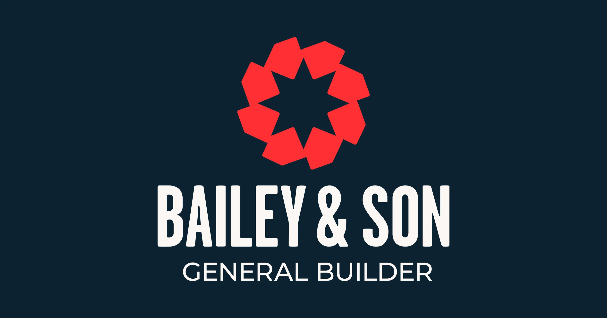
Before any design work, we simplified MP Bailey & Son to Bailey & Son: shorter, easier to remember, and quicker to read at a glance.
THE MARK
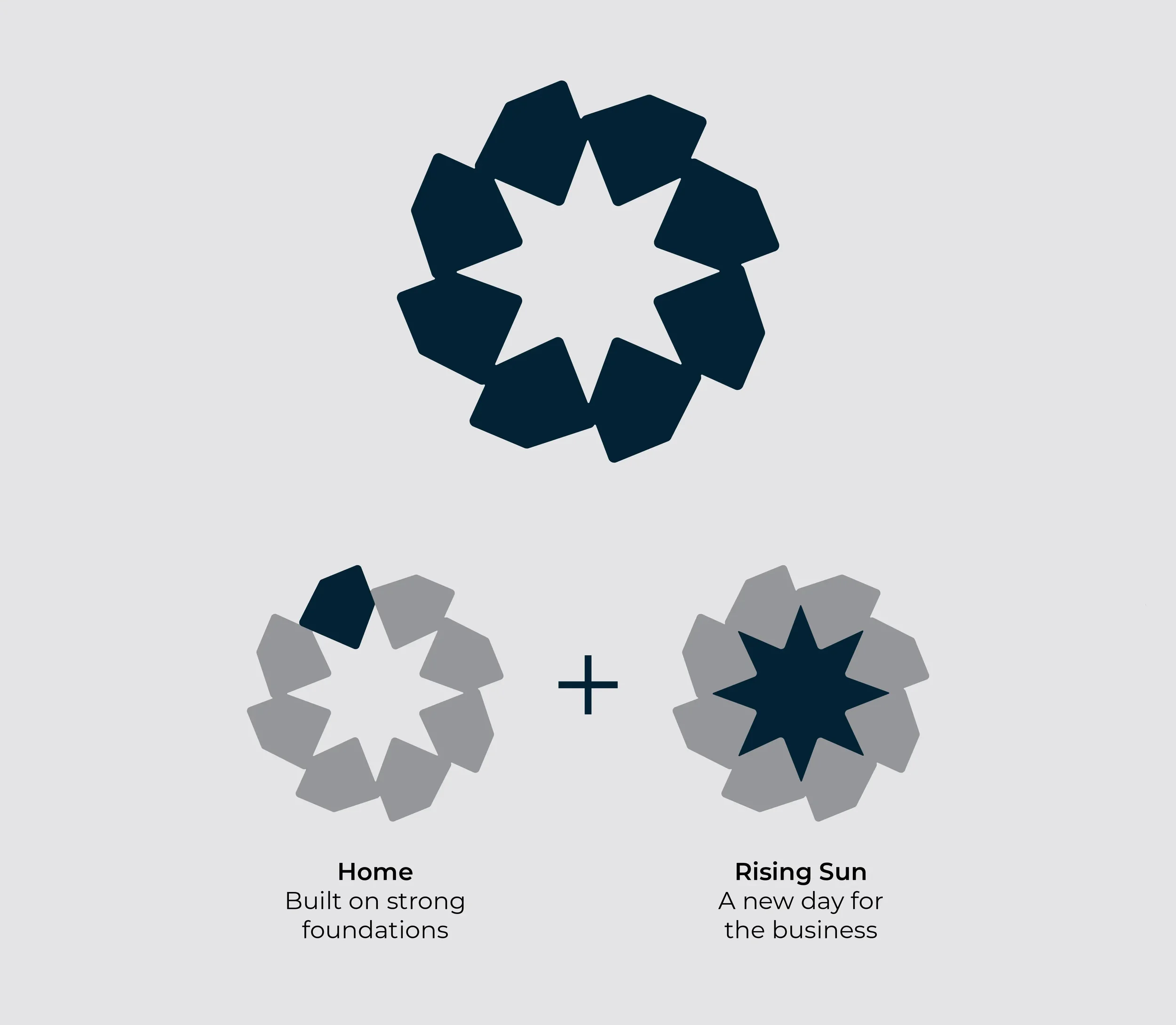
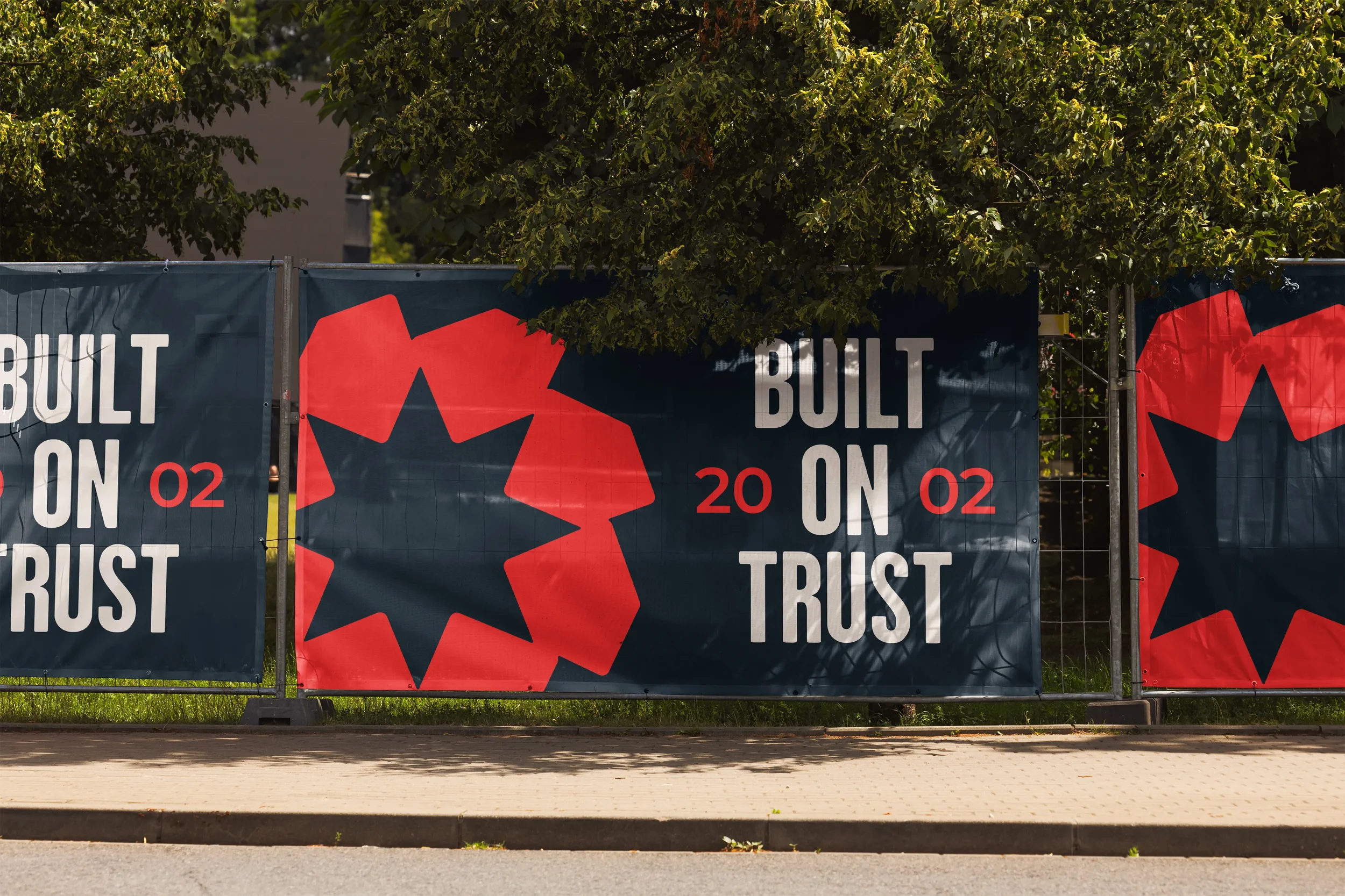
The brand had to say two things: what Mark does, and that this was a new chapter. Eight house forms, a nod to the homes he works in every day, repeat in a circle. In the negative space between them, a rising sun appears: a new day for the business, built from the trade around it. It answered the brief so directly that it was the only concept we presented.
TYPE & COLOUR
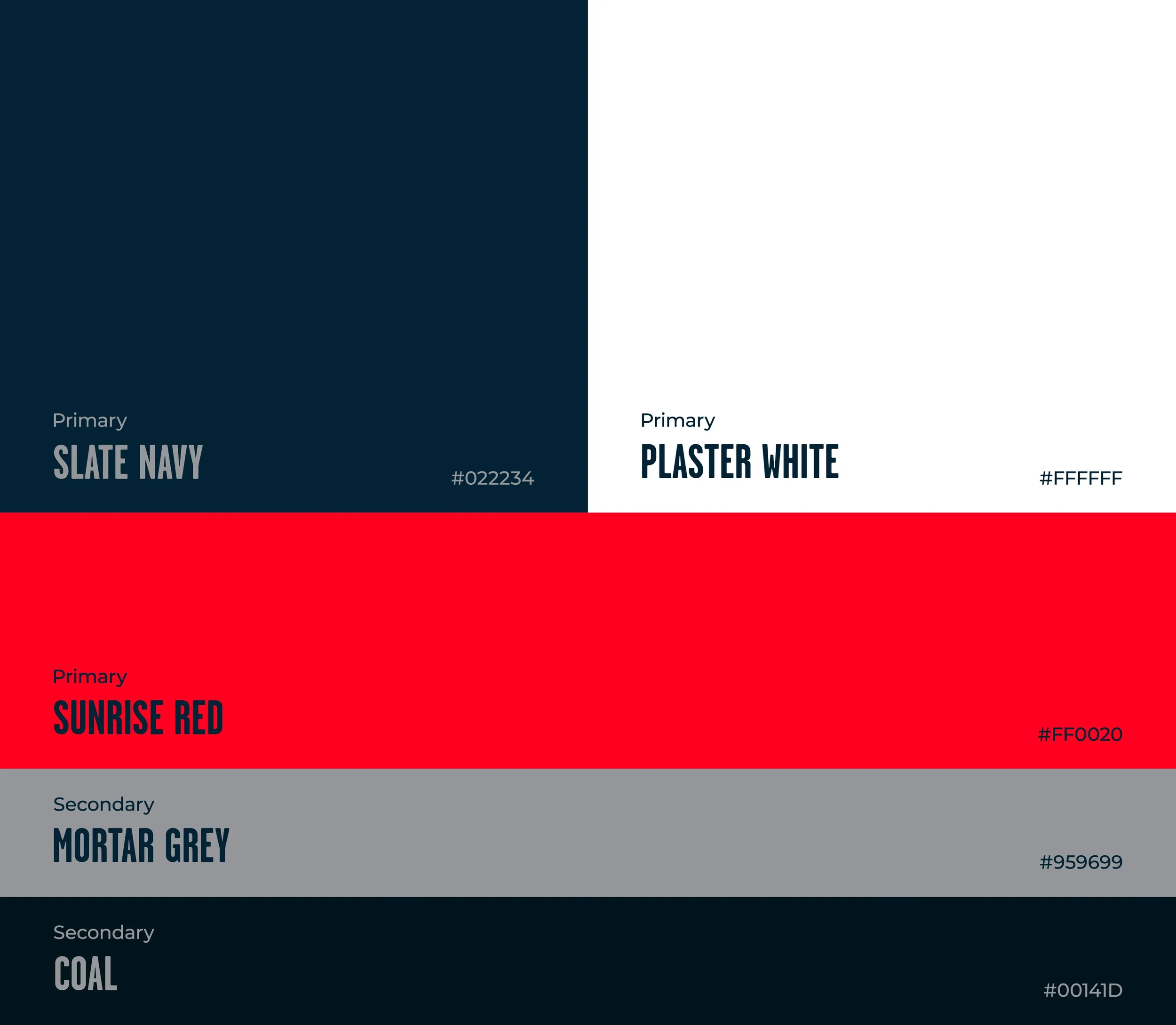
Garage Gothic, inspired by traditional sign writing, brings Mark's love of heritage and craft into the wordmark, with Montserrat as a clean, legible partner. The palette takes his uniform's soft pink, light blue and grey and makes them bolder: a strong red, a deep navy and the same grey. It complements what he already wears, with far more presence.
04 The Outcome
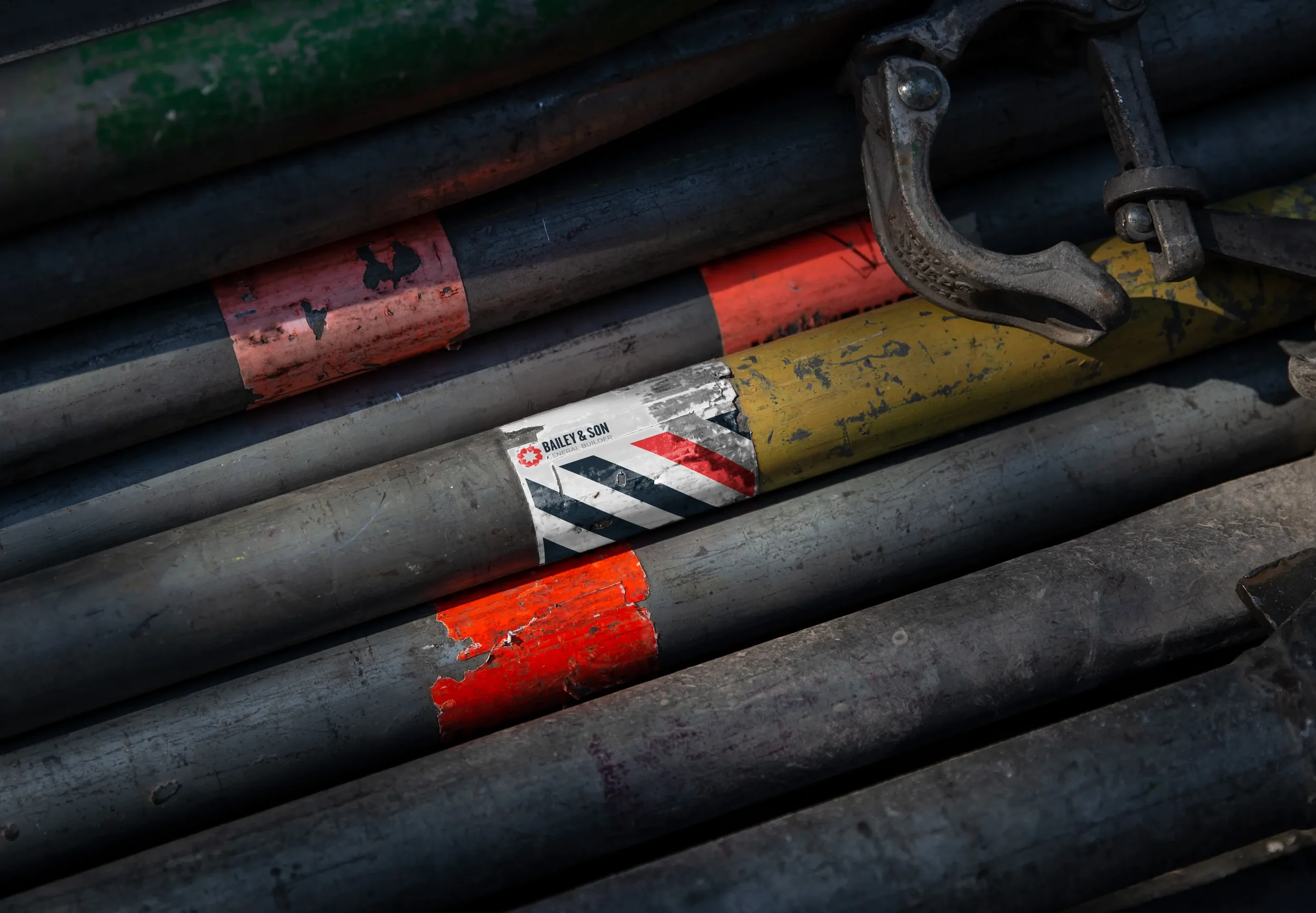
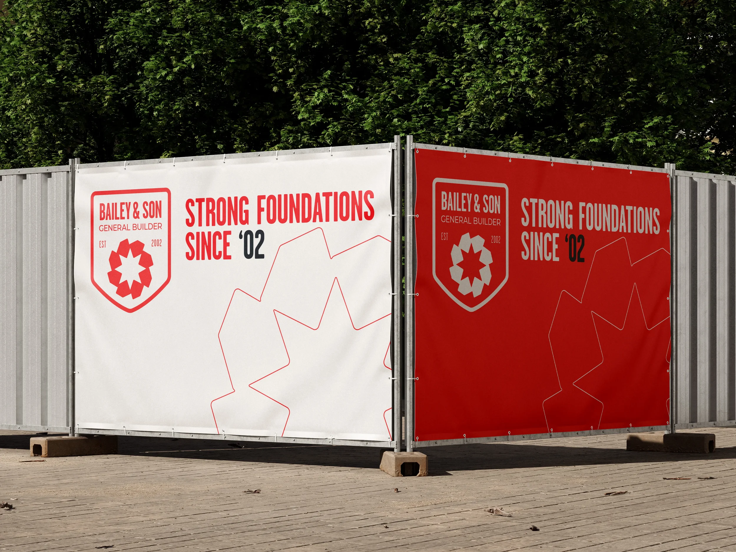
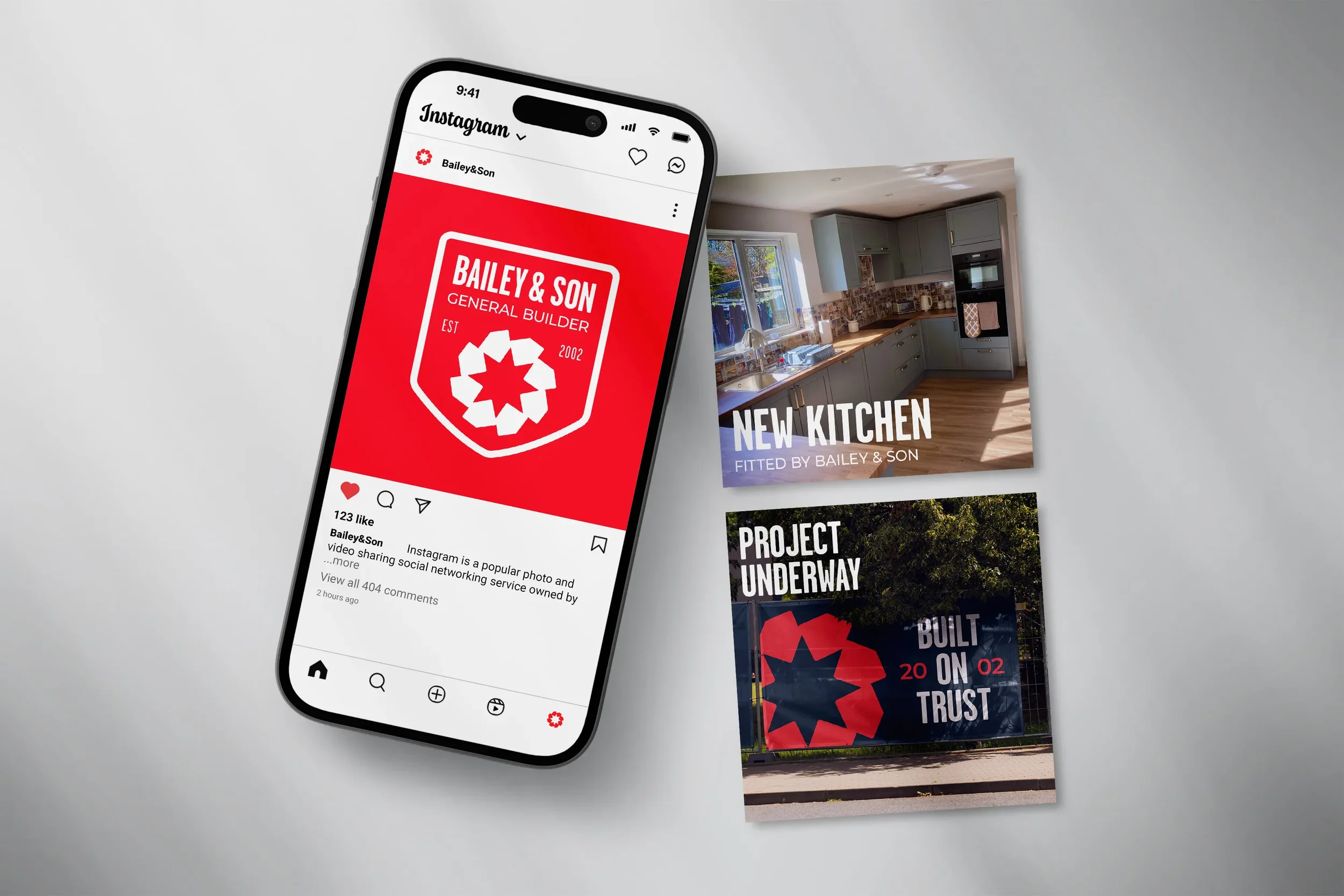
The brand now does its job before Mark arrives on site. A flexible system, all built from the same house form, looks just as sharp on his van as on a business card or his Instagram. People notice it, remember it and know exactly what he does.
05 Testimonial
“I gave Zach & Ryan a brief and a few colours, and they took it from there. They were easy to talk to and kept me updated throughout.
The new branding is on my van and workwear. It makes me easy to spot, shows exactly what I do and gives a positive, professional image. Customers have already commented on how good it looks”.
Mark Bailey, Bailey&Son
Next Project: