Scrub Games
01 The Brief
02 The Challenges
03 The Process
Scrub Games designs and delivers escape rooms for surgical education. Teams of surgeons, nurses, junior doctors and students use their clinical knowledge to solve puzzles against the clock, while learning the teamwork and human factors skills that keep patients safe.
The idea started as a passing thought between colleagues during a robotic bowel resection. It became real during Covid, when routine surgery and training stopped and the team needed something to look forward to. One trial run later, the department was hooked.
As Scrub Games grew from a hospital teaching session into a business delivering at conferences, its founders came to us for a brand to match. They needed an identity that would build recognition, connect with their audience and give them a stronger social presence. In their words, it had to be cool, fun, memorable, playful and witty, without losing the trust of the surgeons it was designed for.
Fun, but taken seriously. Leaning too far into games risked putting off more traditional members of the surgical world.
A niche that needs explaining. "Scrub Games" isn't self-explanatory, so the identity had to tell people what they do at a glance.
Two audiences. It had to excite the people playing and reassure the educators and conference committees booking.
Avoiding medical clichés. The client wanted something different from the usual medical symbols and styles.
FINDING THE BALANCE
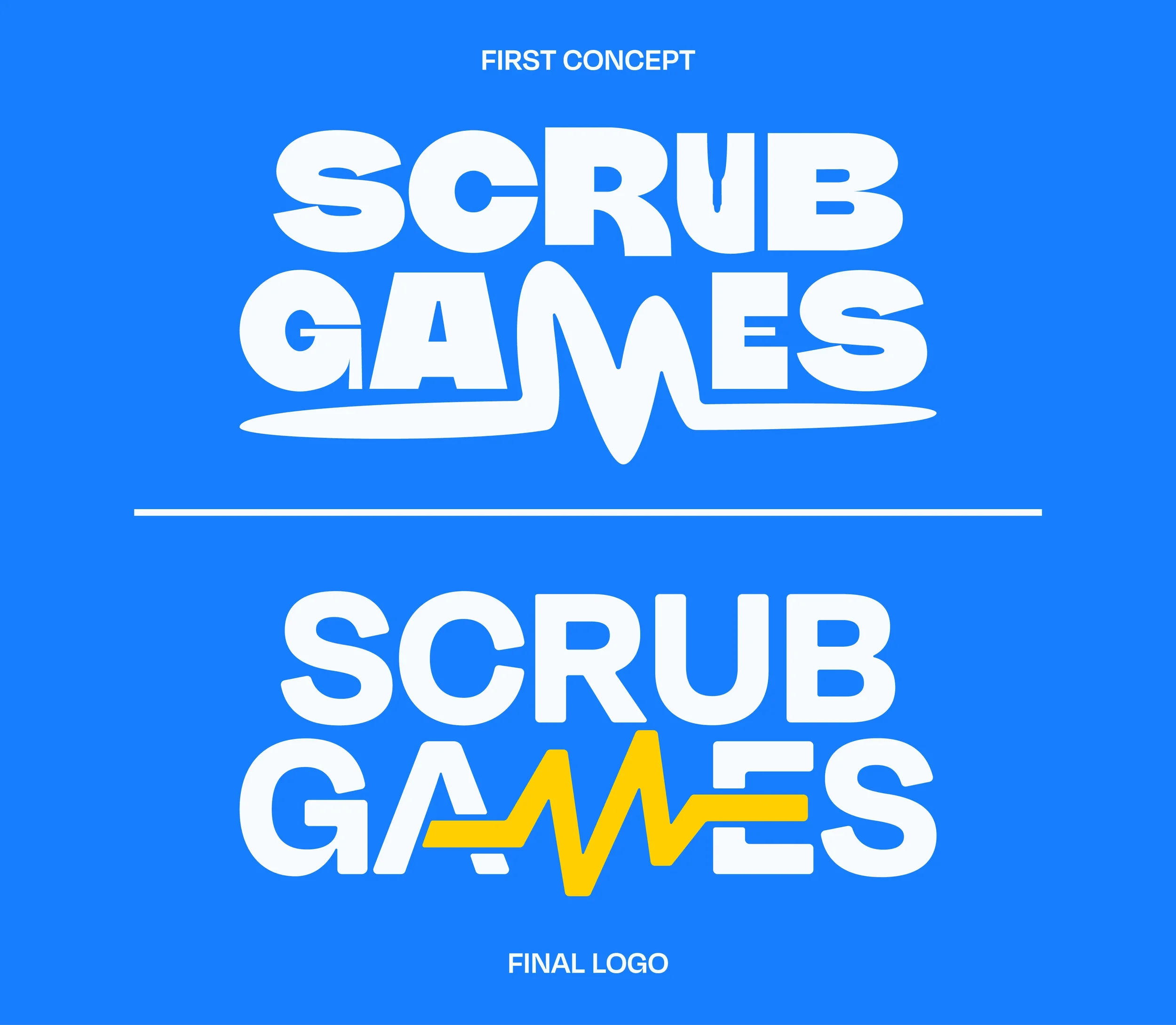
Our first concept went all in on the fun. Warped, bouncy letterforms and a fluid heartbeat sweeping beneath the name made it feel like a game, but it leaned too far into playfulness for a brand that surgeons needed to trust.
Working closely with the team, we refined it. The letterforms became crisper and more confident, and the heartbeat sharpened into a precise clinical trace. The personality stayed, but now it feels professional first and playful second.
THE MARK
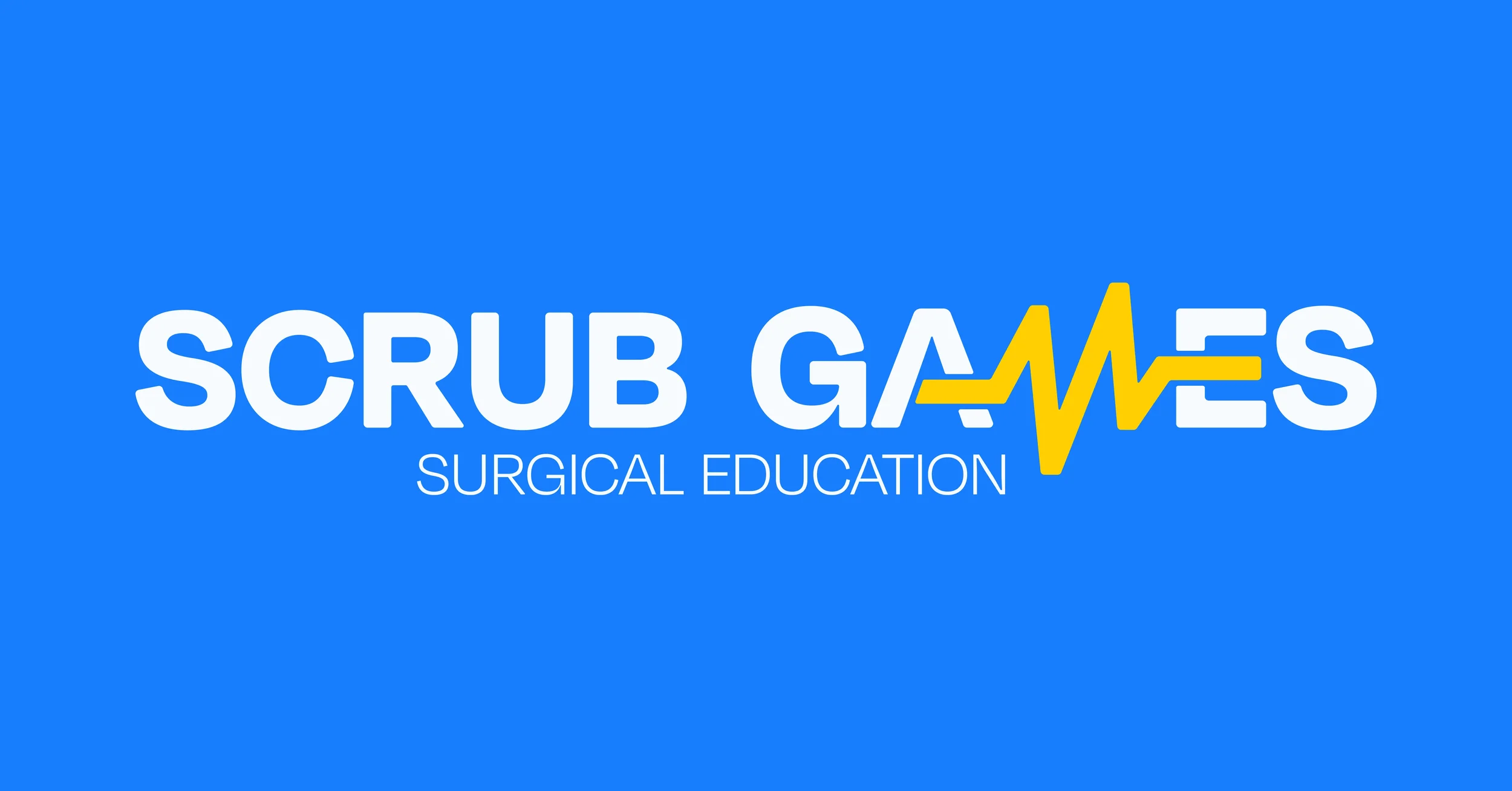
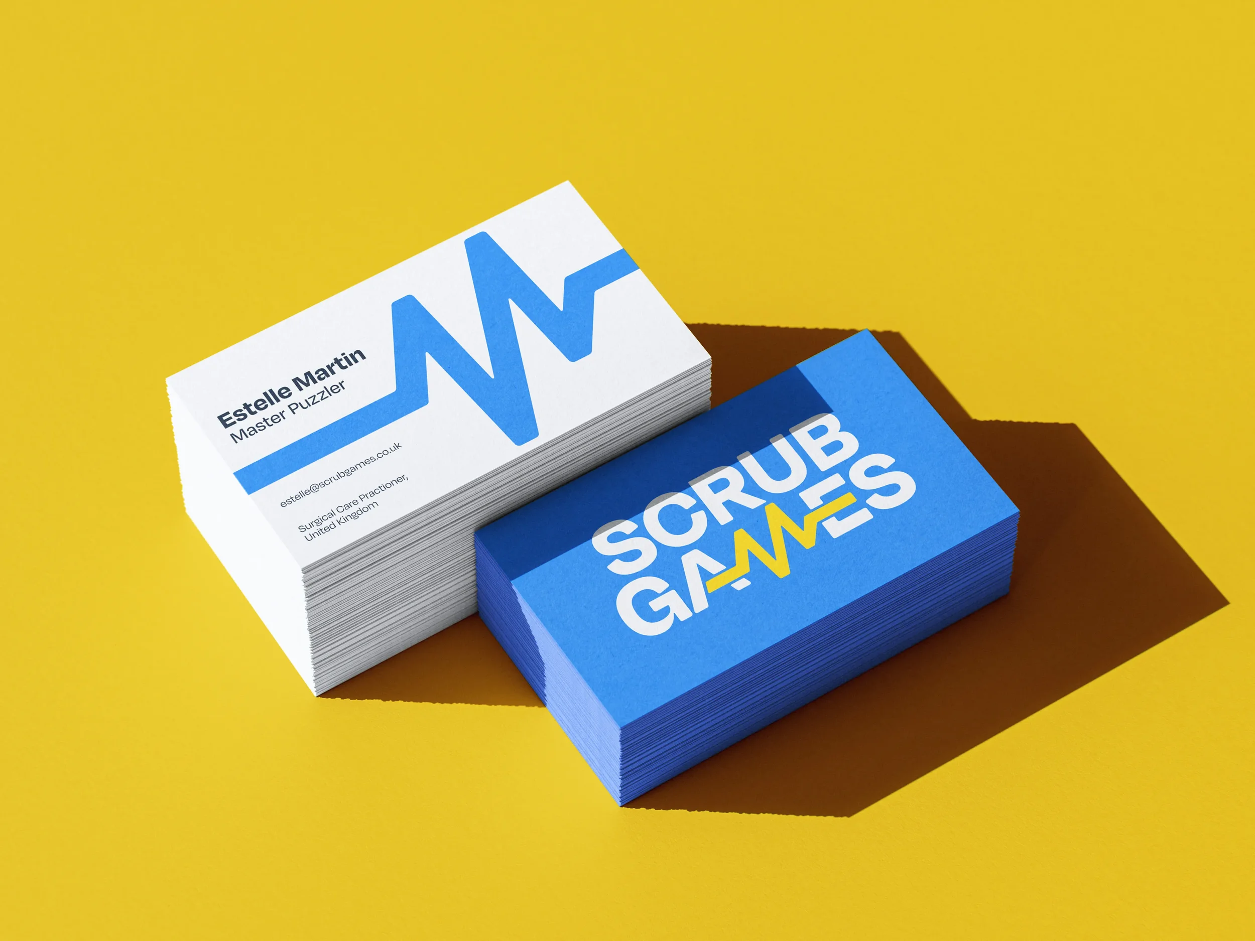
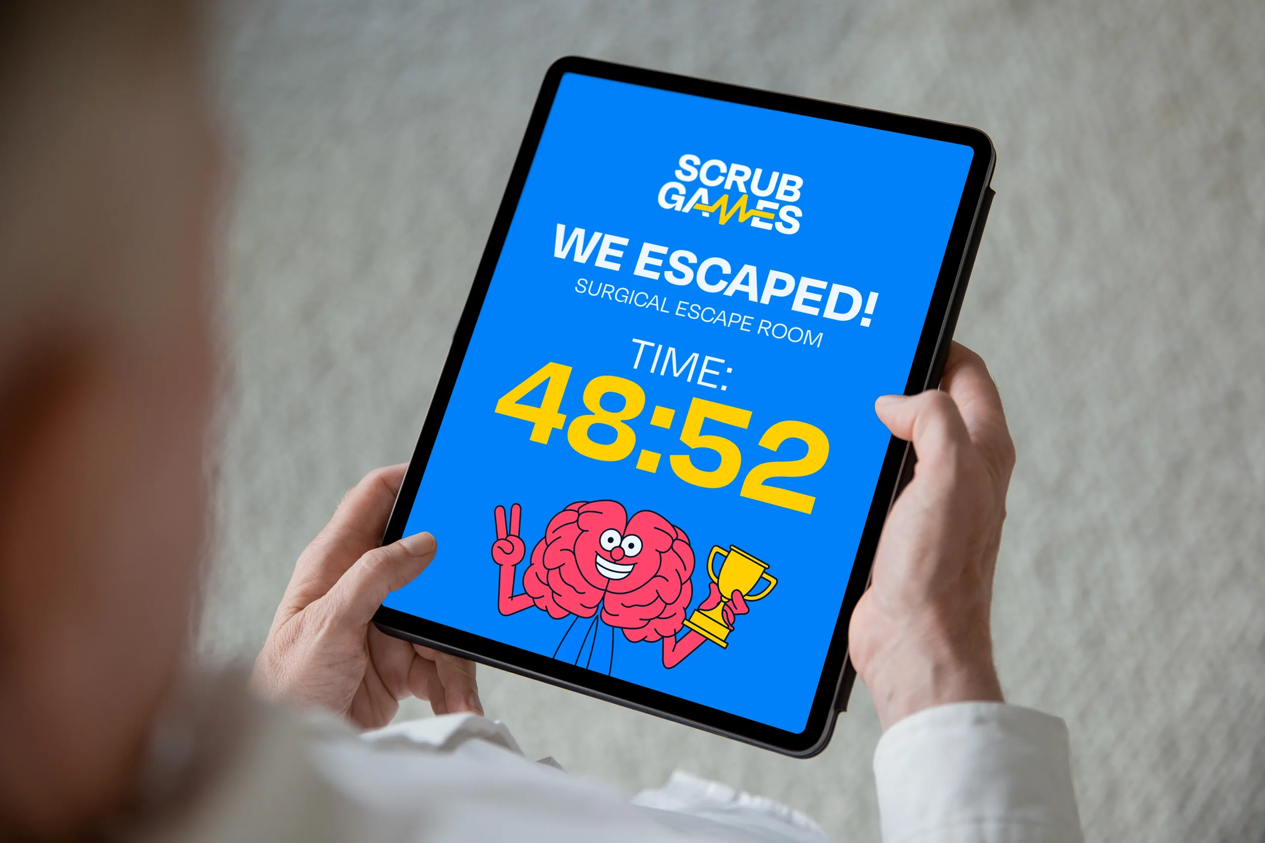
The logo is built around one idea: a heartbeat that takes the place of the M in GAMES. It's a clinical signal hidden in plain sight, like a clue waiting to be found. Bold, stacked lettering keeps it confident and readable at a busy conference, while the tagline tells people exactly what Scrub Games does.
TYPE & COLOUR
Type and colour carry the same balance as the logo: professional first, playful second.
Degular is the sole typeface, modern and bold without feeling clinical, just as the client asked. Degular Bold gives headings a confident presence, Degular Medium keeps body copy clear, and Degular Light sets the tagline.
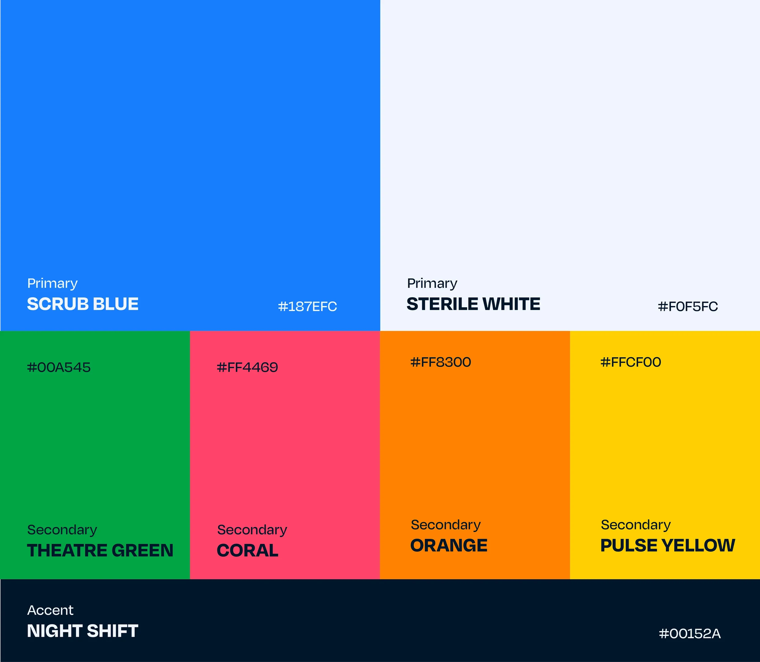
The palette is bright and high-energy, led by a confident blue, with warm accents that bring the playful side to life.
04 The Outcome
Scrub Games now has an identity as distinctive as the service it represents. The heartbeat gives the brand a clinical edge surgeons recognise, while the bold type and bright palette carry the fun of the game.
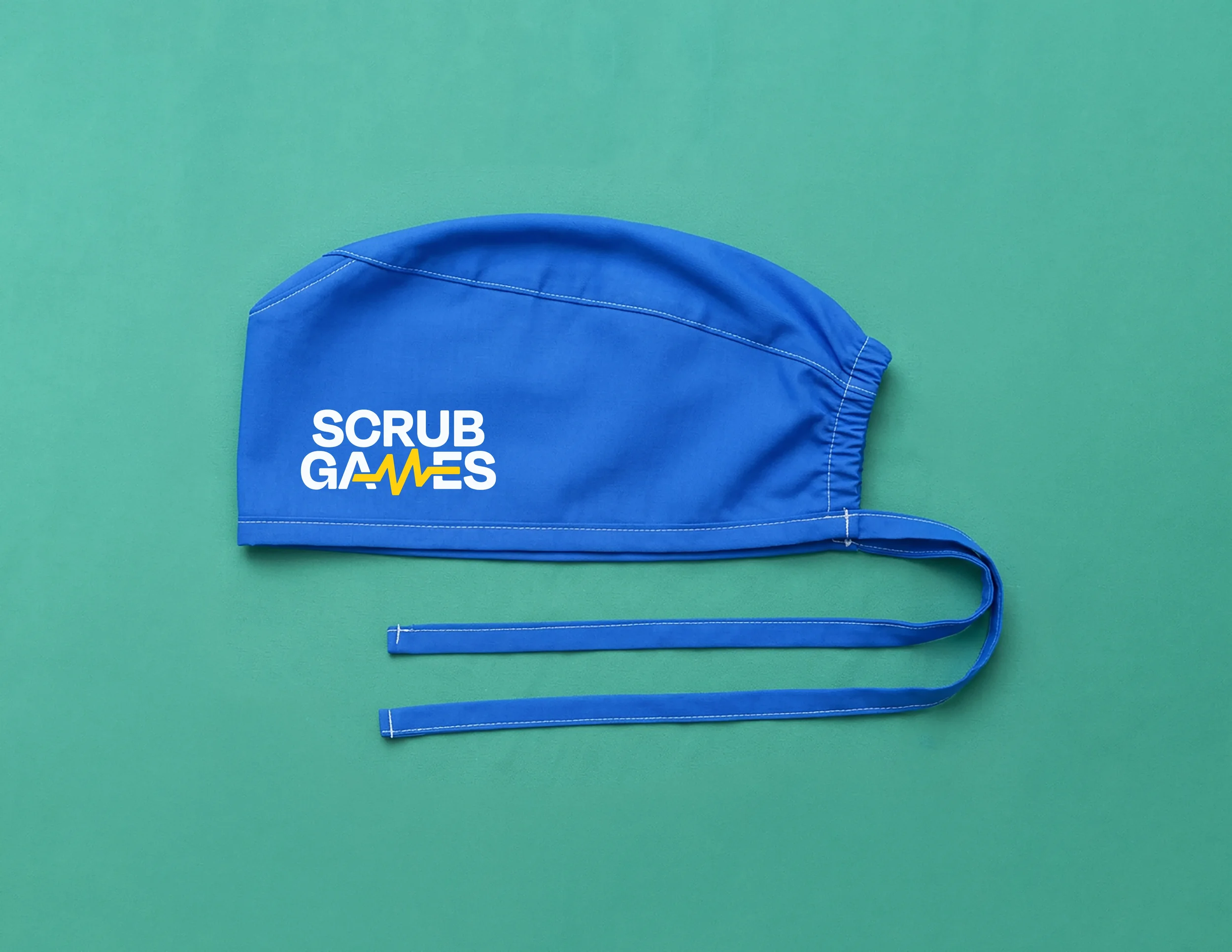
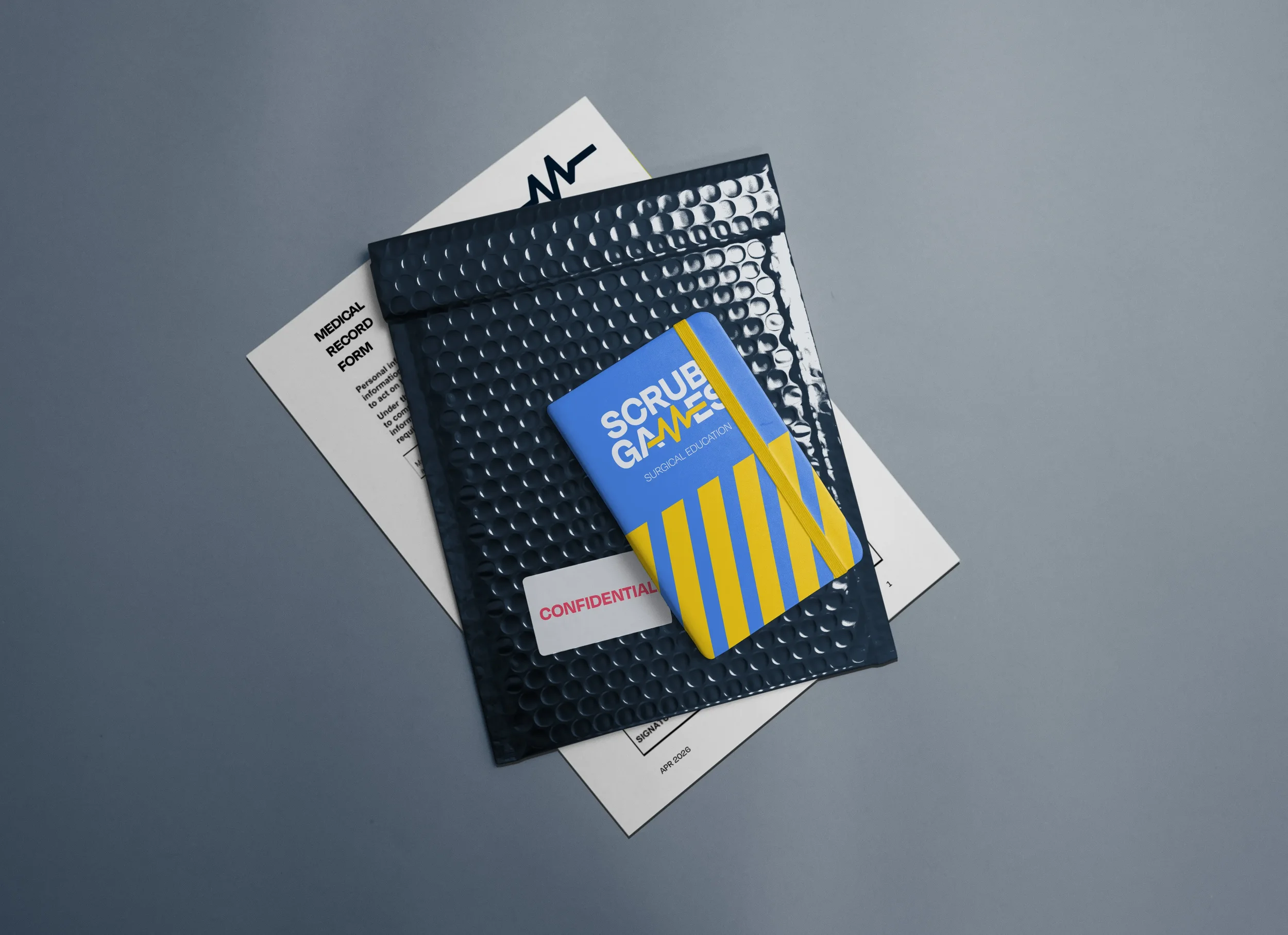
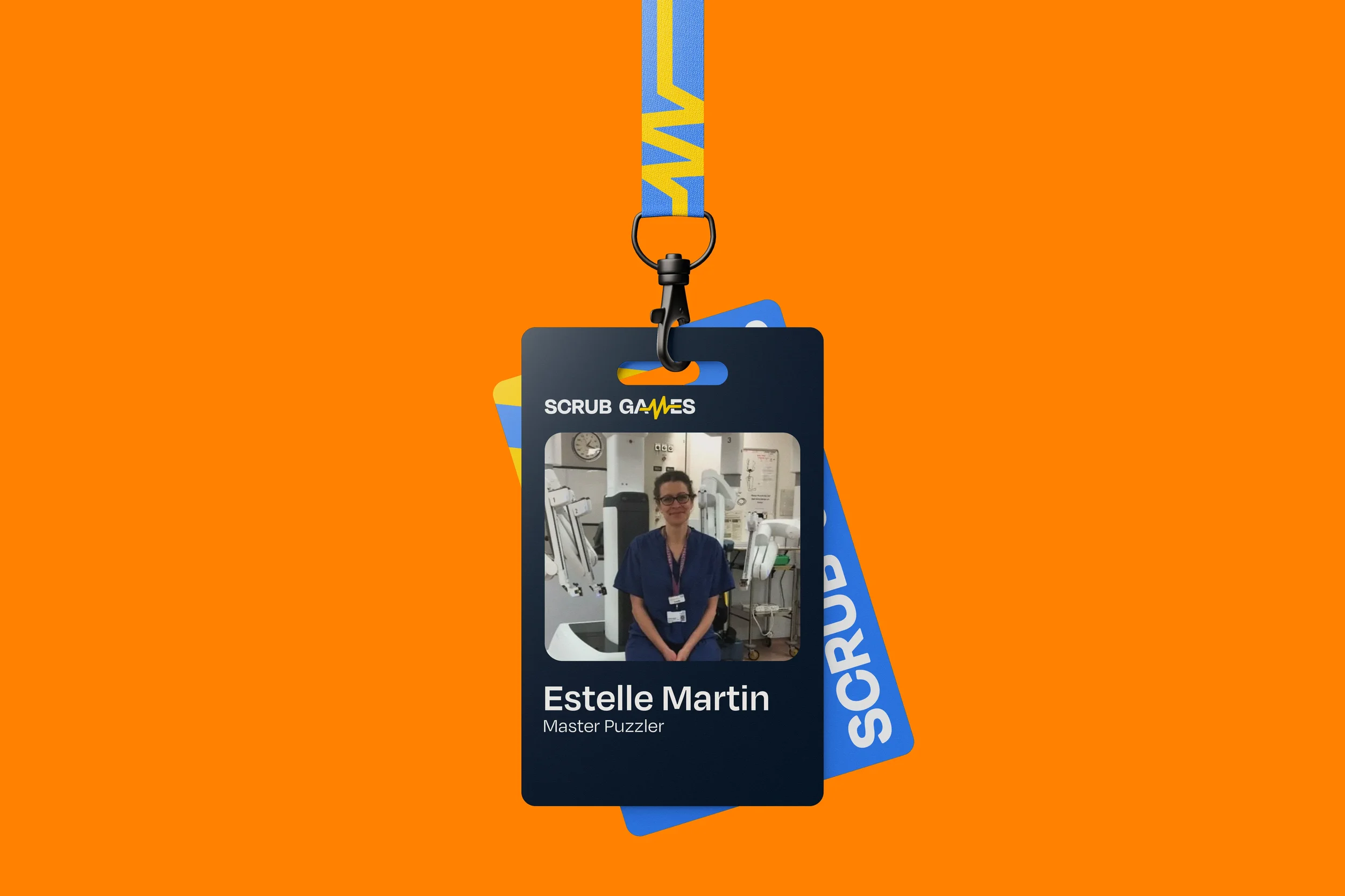
The result is a brand that explains a niche idea at a glance and gives the team a confident face wherever they show up. It now runs across their assets, social media and website, and travels with them to every conference and session they deliver.
05 Testimonial
“I co-run a company providing surgical escape rooms. It's really niche, and something that takes quite a lot of explaining, so I needed a logo that would complement a service as niche as we are in the education field within medicine.
Working with Zach & Ryan was a dream. They were extremely responsive. They took on board our comments on the designs they had developed and were constantly coming back with new and improved concepts.
Working together in this personal, collaborative way, we came up with an absolutely brilliant design that we are extremely proud of, and I cannot imagine our company without it.”.
Estelle Martin, Scrub Games
Next Project: